
Why Visual Consistency Matters in Responsive Design
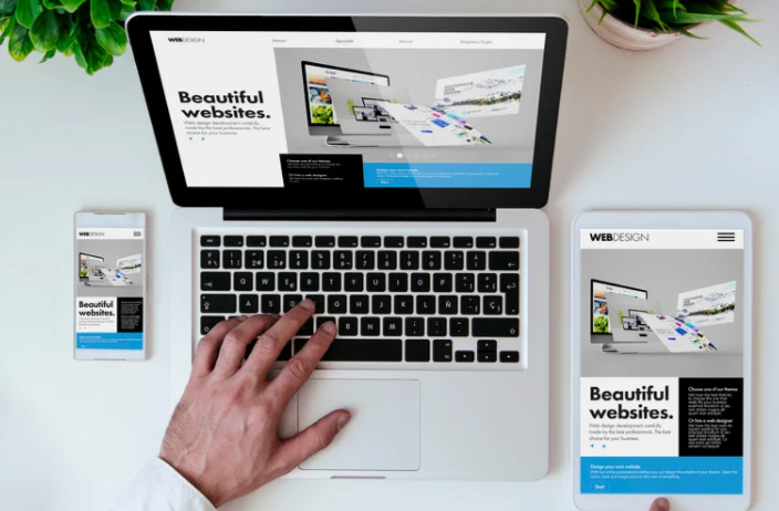
Ever visited a website that looked perfect on desktop but awkward on mobile? That’s what happens when visual consistency in responsive design is ignored. Consistency ensures that your brand feels the same everywhere—whether viewed on a laptop, tablet, or smartphone.
Responsive design isn’t just about fitting content into smaller screens. It’s about preserving brand identity, readability, and balance across every device. When done right, users experience seamless familiarity and trust in your brand no matter how they access it.
What Is Visual Consistency in Responsive Design?
Visual consistency means maintaining the same look, feel, and functionality across all screen sizes. It ensures that users recognize your brand instantly—even when layouts adapt or elements shift.
In responsive design, this involves more than resizing elements. It’s about preserving hierarchy, spacing, proportions, and tone while making adjustments that suit different devices.
For instance, a navigation bar that stretches across a desktop might collapse into a hamburger menu on mobile. Even though its structure changes, its colors, icons, and typography should remain consistent to retain brand recognition.
The Key Principles of Maintaining Visual Consistency
1. Unified Color Palette
Your color palette is the glue that holds your design together. Whether on a 27-inch monitor or a phone screen, brand colors should remain consistent and accessible.
- Use the same HEX or RGB values across platforms.
- Define contrast rules for light and dark backgrounds.
- Test colors under different lighting conditions to ensure visibility.
Consistent use of color reinforces trust and emotional familiarity—two pillars of strong brand presence.
2. Consistent Typography
Typography carries your brand’s tone and readability. To maintain consistency:
- Use the same font families across devices.
- Set clear rules for scaling text (e.g., relative units like
emorrem). - Define line spacing, weight, and alignment for every breakpoint.
Responsive typography ensures that your text hierarchy—headings, subheadings, and body—remains visually balanced, even when screen widths shrink.
3. Scalable Layouts and Grids
A well-structured grid system is the backbone of responsive design. It keeps layouts proportionate and predictable as they adjust to different viewports.
- Use a flexible grid system (e.g., CSS Grid or Flexbox).
- Maintain consistent margins, gutters, and alignment patterns.
- Plan spacing ratios that scale naturally with screen size.
Think of your grid as a flexible skeleton—it bends but never breaks, keeping the visual rhythm intact.
4. Image and Icon Adaptability
Images and icons tell your visual story. To maintain consistency:
- Use vector icons (SVGs) for sharpness on any resolution.
- Optimize images for retina and non-retina displays.
- Keep styling (shadows, borders, filters) uniform across platforms.
Nothing breaks immersion faster than a pixelated logo or mismatched icon style. Treat every visual asset as part of your unified system.
5. Maintain Alignment and Spacing
Whitespace isn’t wasted space—it’s a design tool. It creates focus and rhythm.
When scaling across devices:
- Use proportional padding and margins.
- Avoid cramming elements on smaller screens.
- Test spacing in both portrait and landscape orientations.
Consistent spacing maintains your design’s visual “breath,” making it look polished and intentional at every size.
6. Maintain Interaction Consistency
Buttons, hover effects, and animations contribute to your brand’s personality. They should behave predictably across devices.
- Keep button shapes, colors, and text styles uniform.
- Ensure animation speeds and transitions feel consistent.
- Maintain touch-friendly tap zones for mobile devices.
A consistent interaction pattern helps users feel at home, no matter where they engage with your design.
Practical Strategies for Responsive Consistency
Design with a System, Not Just Screens
Instead of designing for desktop first or mobile first, design system-first. Create a visual library of reusable components—buttons, icons, typography rules—that scale automatically. Tools like Figma and Adobe XD make this process seamless.
A design system keeps your visuals aligned and ensures no designer or developer strays from the brand aesthetic.
Use Relative Units, Not Fixed Sizes
Designing with percentages, em, and rem units allows elements to scale naturally. Fixed pixel values often lead to broken layouts on smaller devices.
This approach ensures your typography, spacing, and buttons maintain harmony across every screen size.
Set Clear Breakpoints
Define logical breakpoints in your CSS where layout changes should occur.
For example:
- Mobile: 320px–480px
- Tablet: 768px
- Desktop: 1024px+
Breakpoints should reflect content needs, not just device widths. This ensures smooth visual transitions between layouts without jarring jumps.
Test Across Real Devices
No simulation beats real-world testing.
- Check color accuracy and readability under different lighting.
- Review alignment and proportion on multiple resolutions.
- Ensure interactive elements feel consistent and intuitive.
Tools like BrowserStack or physical device testing reveal inconsistencies that automated previews might miss.
Build a Style Guide
A visual style guide is your reference manual for brand consistency. It should include:
- Colors, typography, and iconography
- Layout rules and spacing patterns
- Responsive behavior guidelines
This guide acts as your brand’s compass, ensuring that every designer, developer, and marketer stays aligned.
Common Mistakes to Avoid
- Ignoring Typography Scaling
Small text on mobile ruins readability. Always use relative units and test across devices. - Overloading Mobile Screens
Simplify layouts for smaller viewports—less is often more. - Mismatched Colors or Icons
Keep your design assets synced in a shared library to prevent inconsistency. - Neglecting Accessibility
Ensure color contrast, text size, and navigation remain accessible to all users. - Skipping Testing
What looks perfect on a designer’s monitor may break on a phone. Always preview across devices.
Conclusion
Maintaining visual consistency in responsive design isn’t about making every page look identical—it’s about ensuring every experience feels connected.
From color and typography to layout and interactions, each element must reinforce your brand’s identity while adapting gracefully to any screen.
When users move from desktop to mobile without noticing a change in tone, you’ve succeeded. That seamless familiarity builds credibility, trust, and recognition—hallmarks of a truly consistent design system.
FAQ
1. What is visual consistency in responsive design?
It’s the practice of maintaining a cohesive look and feel across devices while adapting layouts for usability.
2. Why is visual consistency important?
It builds brand trust, improves user experience, and helps users navigate intuitively across all devices.
3. How can I ensure consistent typography across breakpoints?
Use scalable units like em or rem, and define a clear text hierarchy for each screen size.
4. What tools help with maintaining responsive consistency?
Figma, Adobe XD, and design systems like Material Design or Bootstrap ensure uniform visuals.
5. How often should I test my responsive designs?
Test at every major update and regularly across real devices to catch inconsistencies early.
