If you’ve ever worked on a design project and thought, “We’ve already created this button three times,” you’re not alone. That’s where a design system comes in. It acts as the single source of truth that unites all your visual components, rules, and design principles into one cohesive framework.
Think of it as both a toolkit and a rulebook—a structured library that defines how your brand looks, feels, and behaves across every platform. From color palettes and typography to button states and spacing, everything is documented, standardized, and ready for reuse.
In short, a design framework ensures that whether you’re designing an app, a website, or a marketing campaign, your visuals stay consistent, recognizable, and scalable.
The Core Elements of a Strong Design Framework
A great visual system isn’t just a style guide—it’s a living, evolving ecosystem. These are its key components:
1. Design Principles
These are the core beliefs that guide every visual and functional decision. For example, a brand might emphasize “clarity,” “efficiency,” and “accessibility” in every product it builds.
2. Components and Patterns
Reusable UI elements—like buttons, cards, forms, and navigation bars—form the foundation of your product library. Patterns show how these pieces work together to solve recurring problems such as login flows, error messages, or onboarding sequences.
3. Visual Guidelines
This section covers everything from typography and grids to iconography and imagery. These rules ensure that every design decision aligns with your visual identity.
4. Design Tokens
Tokens are small, reusable variables—such as colors, spacing, or font sizes—that link design and development. They help maintain visual accuracy when design elements become code.
5. Documentation
Clear documentation is the backbone of an effective system. It guides designers, developers, and marketers on what to use, when to use it, and why it matters.
Why Consistent Systems Matter for Designers
A design system isn’t just an organizational tool—it’s a creative accelerator. It helps you move faster, collaborate better, and maintain visual harmony.
1. It Ensures Visual Consistency
Consistency is the secret to great design. A shared system guarantees that every page, button, and icon feels like part of the same brand. This creates user trust and reinforces brand recognition.
Imagine if Apple’s website, iPhone interface, and packaging all used different fonts or colors. It would be confusing. A unified system prevents that by enforcing harmony across all touchpoints.
2. It Saves Time and Reduces Redundancy
How many times have you designed the same element from scratch? With a predefined library, you don’t have to. You can focus on creativity and strategy rather than recreating the basics.
Reusability means fewer errors, faster workflows, and smoother collaboration between design and development teams.
3. It Bridges the Gap Between Design and Development
Misalignment between designers and engineers can cause delays. A well-structured framework solves that problem. Shared components and clear documentation make implementation seamless, so both teams speak the same language.
4. It Improves Collaboration and Onboarding
When new team members join, they can ramp up quickly by studying your system documentation. It clarifies brand standards, workflows, and component usage. This drastically shortens onboarding time and keeps large teams aligned.
5. It Enhances Accessibility
Accessibility is part of great design, not an afterthought. When accessibility standards—such as color contrast, font sizing, and keyboard navigation—are built into your system, inclusivity becomes automatic.
How Design Frameworks Evolve Over Time
A common misconception is that a design system is static. In reality, it evolves with your brand and users.
As technologies change and user expectations shift, so should your system. Treat it as a living document—one that adapts as your brand grows.
The best examples, such as Google’s Material Design or IBM’s Carbon, are constantly updated. They balance modern innovation with long-term consistency.
Real-World Examples of Unified Systems
Material Design by Google
Google’s Material Design remains the benchmark for cohesive user experiences. It defines motion, color, and layout principles that span Android, web, and desktop platforms—ensuring billions of devices feel visually aligned.
IBM Carbon Design System
IBM’s Carbon framework empowers teams with reusable components, tokens, and accessibility rules. It’s open-source, flexible, and scalable, showing how structure enhances—not limits—creativity.
Atlassian Design System
Atlassian’s approach emphasizes usability and clarity. Its shared framework keeps tools like Jira and Confluence visually consistent yet uniquely branded.
These examples prove that consistency builds trust and usability, no matter how large the organization.
How to Build Your Own Visual System
Creating your first design framework might seem overwhelming, but breaking it into steps makes it manageable.
1. Audit Existing Assets
Start by gathering your brand’s current design materials—colors, fonts, icons, and components. Identify duplicates, inconsistencies, and opportunities for improvement.
2. Define Core Principles
Decide what your brand stands for. Are you minimal and modern, or bold and expressive? Your design philosophy will shape every visual choice that follows.
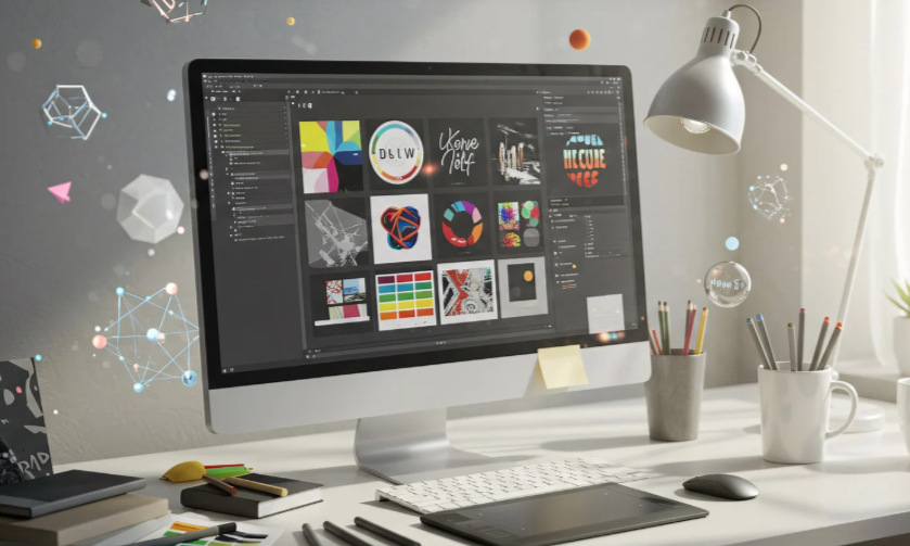
3. Build a Component Library
Develop reusable UI components using tools like Figma or Sketch. Group them logically and maintain consistent naming conventions.
4. Document Everything Clearly
Provide examples, best practices, and accessibility guidelines. Documentation should be easy to understand for designers, developers, and stakeholders alike.
5. Collaborate with Developers Early
Your framework should translate smoothly into code. Partner with engineers to ensure scalability and consistency across platforms.
6. Iterate and Evolve
Launch your initial version, collect feedback, and refine it regularly. A successful design system grows with your team and technology.
Common Pitfalls and How to Avoid Them
Even strong systems can fail if not managed carefully. Avoid these mistakes:
- Building without clear goals
- Overcomplicating the library with unnecessary components
- Neglecting documentation or regular updates
- Ignoring collaboration between designers and developers
- Treating your framework as a one-time deliverable
A design system is an investment that rewards teams willing to nurture it over time.
Conclusion
A design system isn’t just a collection of visuals—it’s the heartbeat of your brand’s identity. It gives designers structure without stifling creativity, allowing them to focus on innovation while maintaining consistency.
Whether you’re part of a startup or a global brand, adopting a visual framework is one of the smartest moves you can make. It ensures that as your products evolve, your brand remains cohesive, credible, and timeless.
FAQ
1. What is the main purpose of a design system?
It provides a shared set of design rules and reusable components that ensure consistency across all projects.
2. How does a design framework help designers?
It saves time, promotes collaboration, and keeps visual elements aligned across different products.
3. What tools are best for creating a design system?
Popular options include Figma, Sketch, Adobe XD, Zeroheight, and Storybook.
4. Is a style guide the same as a design system?
No. A style guide covers visual elements like fonts and colors, while a full system includes components, code, and documentation.
5. How often should a design framework be updated?
Regularly—whenever your brand evolves or new technologies and standards emerge.