Have you ever opened a shared design file and felt completely lost? Buttons are mismatched, fonts vary from screen to screen, and the color palette looks like a rainbow exploded. That’s the unmistakable sign of a lack of visual consistency—and it’s one of the biggest productivity killers in design teams today.
Visual inconsistency doesn’t just make a product look unprofessional; it quietly erodes collaboration, communication, and creativity. Let’s explore how disorganized visuals can divide even the most talented teams and what you can do to fix it.
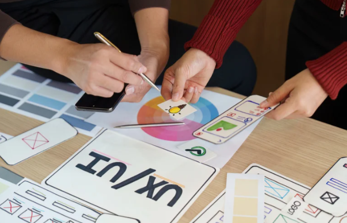
What Is Visual Consistency in Team Design?
Visual consistency means having a unified look and feel across all design elements—colors, typography, spacing, icons, and imagery. When every designer or developer follows the same visual rules, the result is harmony.
But when each team member interprets the brand differently, chaos ensues. The interface feels fragmented, assets become disorganized, and team communication breaks down. Instead of focusing on innovation, everyone wastes time aligning and fixing mismatched visuals.
Consistency isn’t about stifling creativity—it’s about creating a shared language. When teams use the same visual vocabulary, collaboration becomes effortless and efficient.
Why Lack of Visual Consistency Is a Team Problem
A lack of visual consistency doesn’t stay confined to design files—it ripples through every stage of a project. It affects timelines, morale, and even product perception. Here’s how inconsistency quietly undermines teamwork.
1. Miscommunication Between Designers and Developers
When visuals are inconsistent, developers often have to guess which version of a component is correct. One mockup might show a 12px margin, while another uses 16px. These discrepancies lead to endless back-and-forths, revisions, and frustration.
Without a consistent design system, the design-to-development handoff becomes a guessing game. The result? Wasted hours, duplicated work, and a product that feels disjointed.
2. Confusion Across Cross-Functional Teams
Marketing teams, product managers, and copywriters rely on visual references to align messaging and tone. When colors or layouts differ across assets, everyone interprets the brand differently. That inconsistency breeds confusion and forces teams to rework content just to match updated visuals.
What could have been a simple project turns into a tedious alignment exercise.
3. Decreased Productivity
Inconsistent design files make it nearly impossible to move fast. Team members spend extra time searching for correct components, asking clarifying questions, or fixing visual mismatches. Multiply that by several team members and dozens of assets, and productivity drops significantly.
Instead of focusing on innovation, teams end up firefighting inconsistencies.
4. Loss of Creative Momentum
Design thrives on flow—the ability to brainstorm, iterate, and refine ideas quickly. But when visuals lack structure, creative energy gets drained. Designers second-guess choices, developers get frustrated, and the team’s synergy fades.
A unified visual system eliminates that friction and keeps creative momentum alive.
5. Damaged Brand Integrity
Ultimately, inconsistency doesn’t just hurt the team—it hurts the brand. Users notice when visual cues vary from page to page or platform to platform. It creates doubt about the brand’s professionalism and reliability. And internally, it signals a lack of shared standards and discipline.
Real-World Consequences of Visual Inconsistency
Let’s make this concrete. Imagine your design team working on a new app. The UI designer creates a button style in blue, while another uses green for the same action. The marketing designer, unaware of the updates, designs ads using a third variation.
When all assets come together, the experience feels fragmented. The development team now has to reconcile all the differences, delaying the launch. Marketing needs to redo campaigns to align visuals. Customers, meanwhile, wonder if they’re using different products altogether.
All this stems from one root cause: the absence of a single, cohesive visual direction.
The Hidden Cost of Visual Inconsistency
Inconsistency costs more than time—it costs clarity. Here’s how it quietly drains team efficiency and collaboration.
1. Rework and Redundancy
Teams often rebuild the same components repeatedly because they don’t know existing standards. Without a shared library or design system, every project starts from scratch.
2. Fragmented Knowledge
When visuals aren’t documented, knowledge becomes tribal—locked inside individuals instead of shared across the team. If a key designer leaves, the visual direction often leaves with them.
3. Decision Fatigue
Every design choice requires thought. Without clear visual rules, teams debate endlessly over color shades, font sizes, or icon styles. Decision fatigue sets in, slowing progress and frustrating everyone involved.
4. Erosion of Trust
When visuals constantly change, stakeholders and clients lose confidence. They start questioning the team’s competence and direction. That mistrust trickles down, affecting morale and communication.
How to Rebuild Collaboration Through Visual Consistency
The good news? Visual chaos isn’t permanent. With a few structured steps, teams can realign and build a design culture rooted in clarity and collaboration.
1. Create a Shared Design System
A design system acts as your team’s visual bible. It defines the brand’s colors, typography, buttons, icons, and spacing rules. Platforms like Figma, Sketch, and Adobe XD make it easy to create and share reusable components.
When everyone pulls from the same library, consistency becomes automatic.
2. Document Everything
Document color codes, font sizes, spacing ratios, and image styles. Even minor details like hover states or border thickness should be clearly defined. This eliminates ambiguity and ensures that all team members have a single source of truth.
Style guides and documentation tools like Zeroheight or Notion can help you maintain clarity.
3. Centralize Communication
Scattered feedback leads to inconsistent decisions. Use collaborative tools like Figma comments, Slack channels, or Asana boards to keep all design discussions visible and centralized. Transparency helps everyone stay aligned.
4. Conduct Regular Design Reviews
Hold weekly or biweekly design syncs to review progress, spot inconsistencies, and reinforce visual standards. Peer feedback promotes accountability and helps catch issues before they spread.
5. Foster a Culture of Ownership
Visual consistency is everyone’s responsibility—not just the design team’s. Encourage developers, marketers, and product managers to flag inconsistencies and suggest improvements. When ownership is shared, collaboration thrives.
The Role of Leadership in Maintaining Consistency
Strong leadership is crucial for sustaining visual unity. Design leaders and managers must set the tone by prioritizing consistency as a core value.
That means investing in design systems, approving time for documentation, and ensuring every project follows established guidelines. Teams mirror leadership behavior—if consistency matters to management, it will matter to everyone.
Leaders should also encourage collaboration between design and development. When both sides co-own visual standards, the gap between vision and execution disappears.
Benefits of Restoring Visual Consistency
When visual alignment is restored, teams unlock a wave of benefits that extend beyond aesthetics.
- Faster Collaboration: Everyone works from the same foundation, reducing back-and-forths.
- Improved Quality: Fewer design errors and visual inconsistencies reach production.
- Stronger Brand Identity: Every touchpoint feels cohesive and professional.
- Higher Morale: Teams feel confident and aligned in their creative direction.
- Better User Experience: Consistency translates to clarity and trust for end-users.
Simply put, a visually aligned team is a productive, creative, and confident one.
Conclusion
A lack of visual consistency might seem like a design issue, but it’s really a collaboration problem. It slows progress, frustrates teammates, and weakens your brand’s impact.
By building shared systems, documenting standards, and fostering open communication, you can turn visual chaos into creative harmony. The goal isn’t just to make things look good—it’s to help your team work better together.
When everyone sees and speaks the same visual language, collaboration doesn’t just improve—it thrives.
FAQ
1. Why does visual consistency matter for teamwork?
It creates a shared design language that improves communication, speeds up workflow, and reduces confusion across teams.
2. How does lack of consistency affect developers?
It forces developers to make assumptions about design details, leading to rework, bugs, and missed deadlines.
3. What’s the best way to maintain visual consistency?
Use a design system with documented components, colors, and typography that every team member can access.
4. Can visual inconsistency hurt brand trust?
Yes. Inconsistent visuals make products look unpolished and can cause users to question the brand’s professionalism.
5. How often should teams review design consistency?
Regularly—ideally every one or two weeks—to catch issues early and keep everyone aligned on visual standards.